Gnuplot Reference and Tips
Although other people may prefer ggplot or matplotlib, I have yet to find a tool as stable, versatile, and easy to configure as Gnuplot. This page collects examples of plots generated by Gnuplot, ranging from simple examples of line plots, to much more complicated multi-plots and candlesticks. This page also lits some tips for producing beautiful plots in general, such as how to set font sizes and line styles to maximize readability and clarity.
Gnuplot Basics: Style Files
Typically, a given research paper will have many plots. This can become problematic for you as an author if you need to make a change to all of your plots. For example, suppose you want to recreate all your plots in black and white as opposed to color. Managing many plots also represents a consistency challenge: it is aesthetically pleasing if all the plots in a paper have the same visual style (e.g. fonts, line weights, etc), but this can be difficult to achieve if the plots are spread across many files.
An easy way to manage this complexity and improve the consistency of your figures is to use a style file. Gnuplot scripts can use the 'load' command to import settings and commands from another file, which I will refer to as a style file. The style file is a good place to set all of the properties that will be shared across all of your figures, e.g. the output format, color vs. greyscale, font sizes, line colors, weights, and style, etc. If all of your plots load from a style file, then they will all end up with consistent style, and, if you ever need to make a stylistic change, you can simply modify the style file, as opposed to editing each plot individually.
In many cases, I will actually use three style files, which I will call style2, style3, and style4. The idea here is that plots that are placed two in a row need to have different styling than plots placed three or four in a row. (Specifically, the more plots you place in a row, the smaller they will be. Thus, you will need larger fonts and heavier line weights to compensate in the smaller plots). Having three style files makes life easy: it keeps your styles consistent across figures of different size, and it also means that if you decide to change the number of plots per row, you can simply switch to those figures to the corresponding style file.
Download Example Gnuplot Styles
General Gnuplot Tips
Making sure that your plots are easily readable are a critical part of presenting research. If your plots are hard to read or unclear, it harms people's ability to understand your work, and it may make reviewers hostile to your paper. As such, it is important that you pay attention to the style and clarity of your plots, to maximize readability. In this section, I outline several tips and strategies for generating beautiful, consistent plots.
Font Sizing
A common mistake is for people to generate plots with fonts that are too small. The appropriate size of fonts depends on the size of figures in your paper. For plots that are going to be column width (i.e. placed in rows of two), use 20 point font. For plots that are going to be placed into rows of three, use 32 point font, while four in row should use 40 point font.
Line Width
Another common mistake is for people to generate plots with very faint lines. This is problematic if the plot has several lines, because it becomes very hard to determine which line is which. For plots that are going to be column width, use 5 point line width. For three in a row, line widths of 8 points should at least be considered; for four in a row, 12 point lines are recommended.
Line Styles and Uniform, Intuitive Plots
The style of a line determines whether it is solid, dashed, checked, etc. There are also different styles of points, like empty circle, filled circle, cross, star, etc. In general, some styles of lines and points are easier to read; pay careful attention when generating plots to select styles that are readable and have high contrast (i.e. you can easily tell the different lines apart).
In addition to choosing line styles, the order in which lines are plotted, and the consistency of styles across plots, are also important aspects to keep in mind. In general, I obey the following two rules:
- Order the lines in the plot from left/top to right/bottom. This means that lines that are closer to upper right hand corner, appear first in the key. This makes it easier for readers to match lines to key entries.
- Always use the same line style for each logical line in your plots. For example, suppose you are plotting values related to Faculty, Graduates, and Undergrads. Pick a line style for each category and use it in each plot you generate. This ensures that each category looks the same in each plot, regardless of the order the lines are plotted in. This strategy increases consistency, and makes it easier for readers to compare data across plots.
Line Plots, Error Bars, Arrows, and Labels
The following example plot demonstrates several common features in Gnuplot: lines, error bars, labels, and arrows.
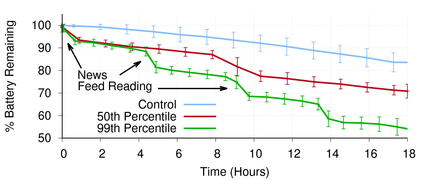
A few notes: if you plot the lines and the error bars in a single command, then the error bars take the style of the line. This tends to make them look very weird, both because of the dashing in the line, and also because of the lines thickness. It's best to plot each line twice: once for the line, and once for the error bars, using different lines styles for each.
Arrows and labels are positioned relative to the graphs axis. For labels, the given point corresponds to the bottom left corner of the label.
Multiplots
Gnuplot includes the ability to generate multiple plots in a single file. This feature is called multiplot. Multiplots are useful for smashing multiple histograms into a single plot, or for adding inset graphs that focus on details of the larger plot. In the following example, I use multiplots to generate a CDF that starts at X = 0 (Gnuplot forces you to start CDFs at X = 1 normally).
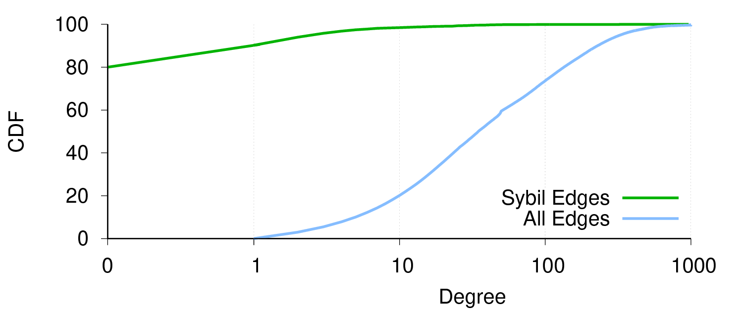
The plot is essentially a hack. The [0:1] range is a plot, and the [1:1000] range is a separate plot. By playing around with the size and location of each plot, you can make it look like they are one plot.
A few notes on obscure commands:
- nomirror causes the tic marks on an axis to only appear on the side with the labels.
- set border [1 + 2 + 4 + 8 ] This command controls which sides of the border are drawn for a given plot. The bottom is 1, left is 2, top is 4, and right is 8. Add the numbers up to draw multiple borders, e.g. to draw just the bottom (1), left (2), and top (4), then you want 1 + 2 + 4 = set border 7.
Scatter Plots
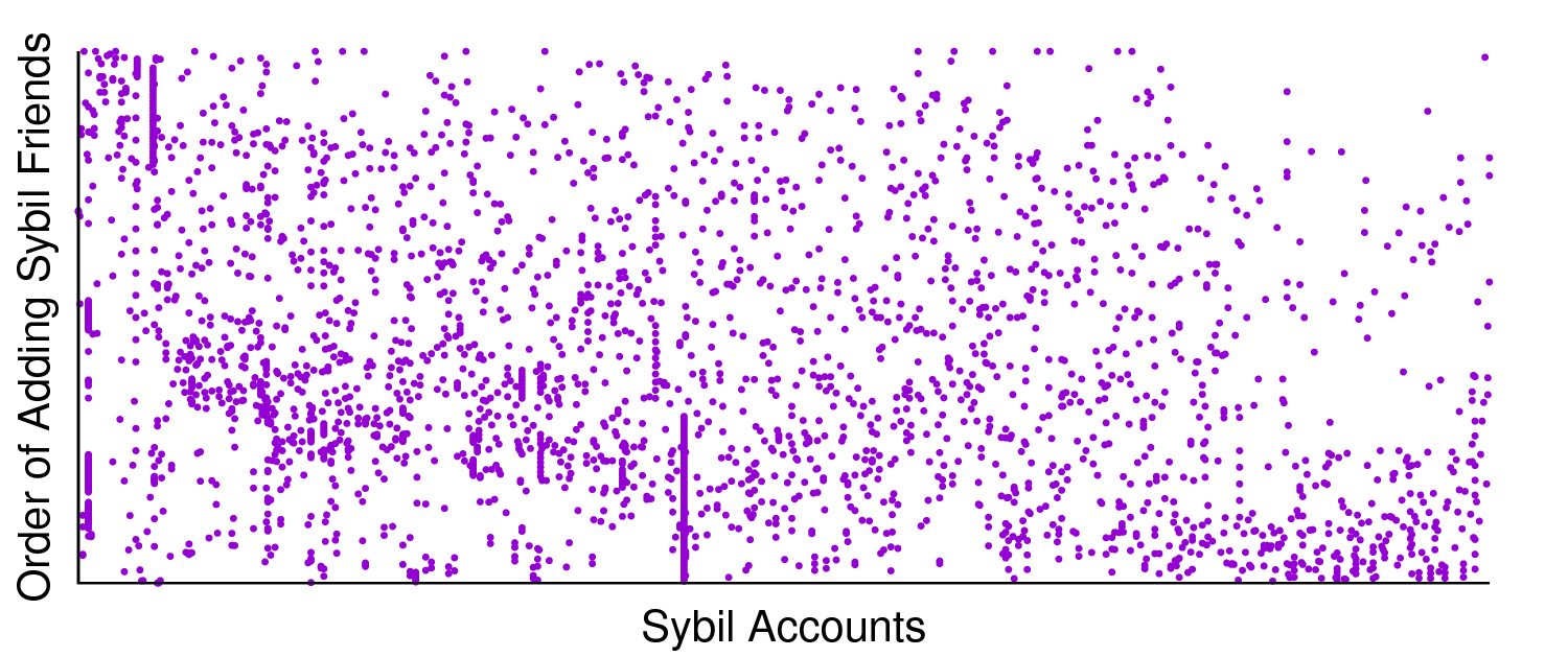
Usually, scatter plots in Gnuplot are generated using the dots style. However, dots are very, very tiny (subpixel size) and there is no way to increase their size. Thus, if your scatter data is relatively sparse, dots style tends to produce very faint, unreadable plots. An alternative is to use points style, and hack it to use pointtype 7 (which is a small, filled circle), and decrease the pointsize. This gives the illusion of larger dots, and makes for easier to read plots. Example:
Histograms (a.k.a Bar Graphs)
Gnuplot kind of sucks at generating bar graphs. Frankly, it's way harder than it needs to be just to generate a decent looking plot. Here are two examples of histograms in Gnuplot: a standard bar and a stacked bar:
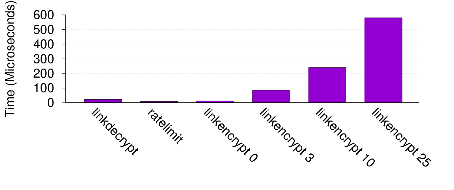
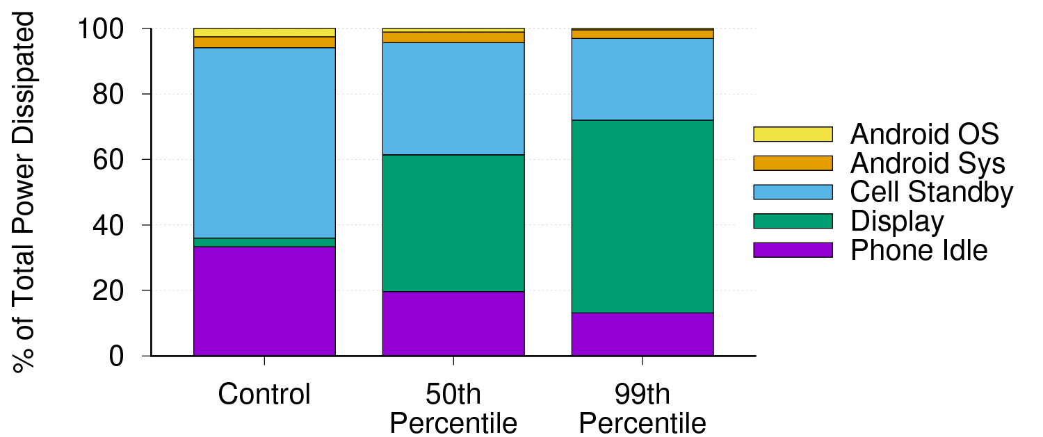
The first example is interesting because it includes rotated x-labels that are read from the data file, and a y-axis grid. The second example uses modified borders and forced line breaks in the labels.
The most important Gnuplot variables to tweak when generating histograms are the boxwidth and the xrange. Gnuplot uses an inscrutable algorithm to layout the boxes on the x-axis, and finely tuning the boxwidth is the only way to get the bars to fill up horizontal space. Similarly, Gnuplot often leaves gobs of whitespace to the right and left of the plot; shrinking the xrange is the best way to eliminate the wasted space.
Candlesticks (a.k.a. Box and Whiskers)
Candlestick plots are super cool. Each candlestick typically shows five values, capturing 4 distinct points in a distribution as well as its average of median. Because each bar shows five values, candlestick plots are very information dense. Here is an example of a candlestick plot, showing the minimum, 5th percentile, median, 95th percentile, and max of several distributions.
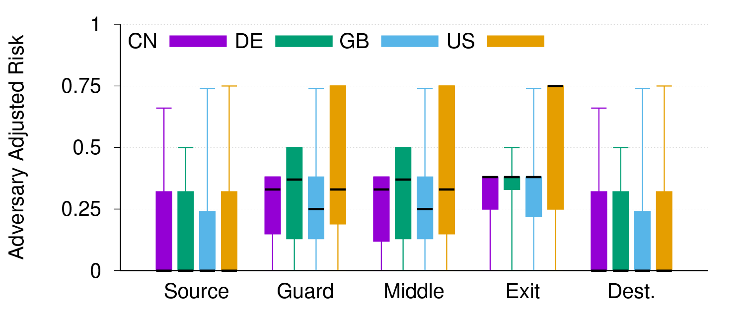
Unfortunately, plotting candlesticks is not easy. Each bar in the figure requires five data points, representing the position of the bar on the x-axis, the bottom of the box, the bottom whisker, the top whisker, and the top of the box, in that order. To plot the median, you plot a second candlestick (with no whiskerbars) at the same x-coordinate, with all four positions set to the median. The same styles that control the look of histograms are also used in this case to control the look of the candlesticks.
Other Resources
The Gnuplot Not So Frequently Asked Questions site is amazing. Almost everything in this guide can also be found on that site.